
EBM Chiropractic
Elite Body Mind Chiropractic Clinic
ROLE
Freelance Web/Graphic Designer
(UX/UI Specialist)
DURATION
January 2026 - February 2026
TOOLS
Figma
Squarespace
Context
Reimagining a chiropractic clinic's website
Elite Body Mind Chiropractic is a chiropractic clinic based in Artesia, California. As a Freelance Designer, I worked directly with the client to revamp their digital and print presence through redesigning their website to address reported usability concerns and refreshing their promotional brochures and flyers to better reflect the clinic's brand and services.
How do I redesign a healthcare clinic's digital and print presence to transform an inaccessible, outdated experience into one that is visually cohesive, easy to navigate, and optimized for both search discovery and patient engagement
Exploration & Ideation
Major pain points centered on site visibility and responsiveness
After our initial client meeting, I set focus on ensuring the site was visible to search engines and looked consistent across both web and mobile devices.
Pain Points
Wireframes & Branding
I presented 4 variants of the new website
Upon establishing a clear branding scheme of sleek minimalism, I met with the client to discuss formatting and utilized feedback to ensure my designs correctly aligned with the brand’s vision.
Light
White has a very high contrast, gray looks a bit unprofessional/unfinished
Package options organized by type rather than bundled deals
More attention drawn to packages themselves, but still a bit too stark of a contrast
Changed format of membership options to make cards larger so there is more whitespace = easier to read
Background is easier on the eyes, but white cards still caused strain to users
Edited format to be organized by bundled deals to draw more attention to the packages and savings
Easier on the eyes, changed format of bundled deals to enhance grouping so formatting is easier to read
Designing & SEO
I utilized a mobile-first approach and optimized with SEO keywords
With client concerns of device responsiveness, I designed with a mobile-first approach to ensure the website was accessible on phone breakpoints, especially since a majority of clients view the site from their phone. To address search engine visibility, I made sure each page of the website included proper heading tags and SEO keyword usage within meta descriptions
Upon final revisions and clear communication with the client, I handed off the final website and brochure designs for deployment and printing.
Feature #1
WEBSITE
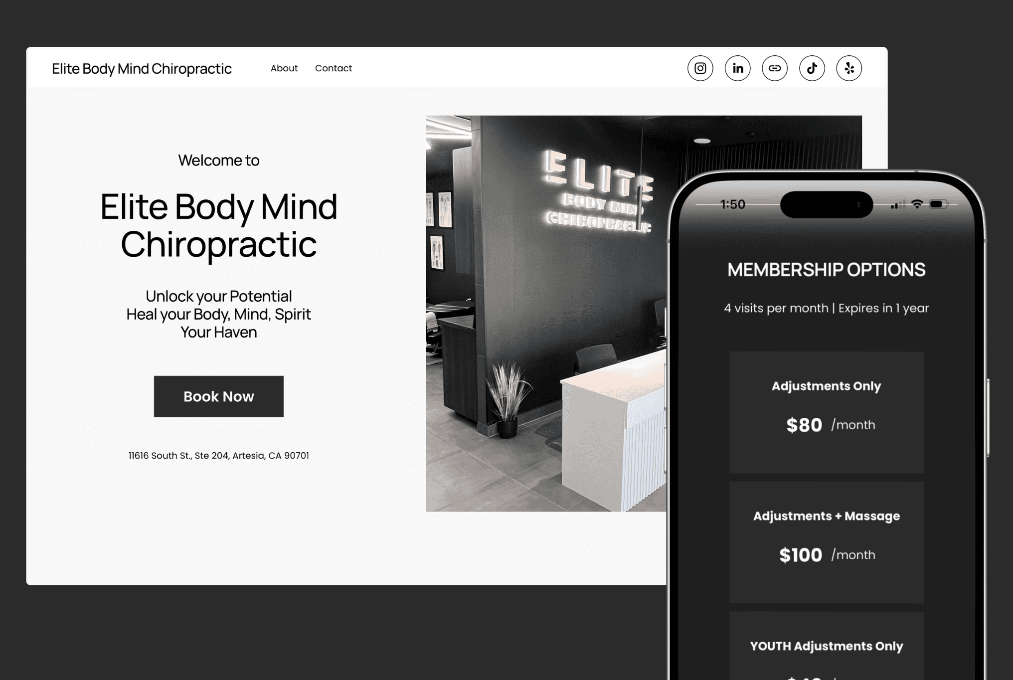
The overall website was redesigned to match the clinic's overall aesthetic: sleek, clean, and minimal.
I added a "Who We Are" section after the introductory video to add another touch-point to view the "About" page and build credibility before showcasing the price list.
The price list was structured to show the benefits of each package deal and make it easy to determine which packages are most worth for customers' needs.
The "About" page showcases more information about EBM's practices along with building credibility by showcasing the practitioners' professional credentials and personal words.
Feature #2
BROCHURE
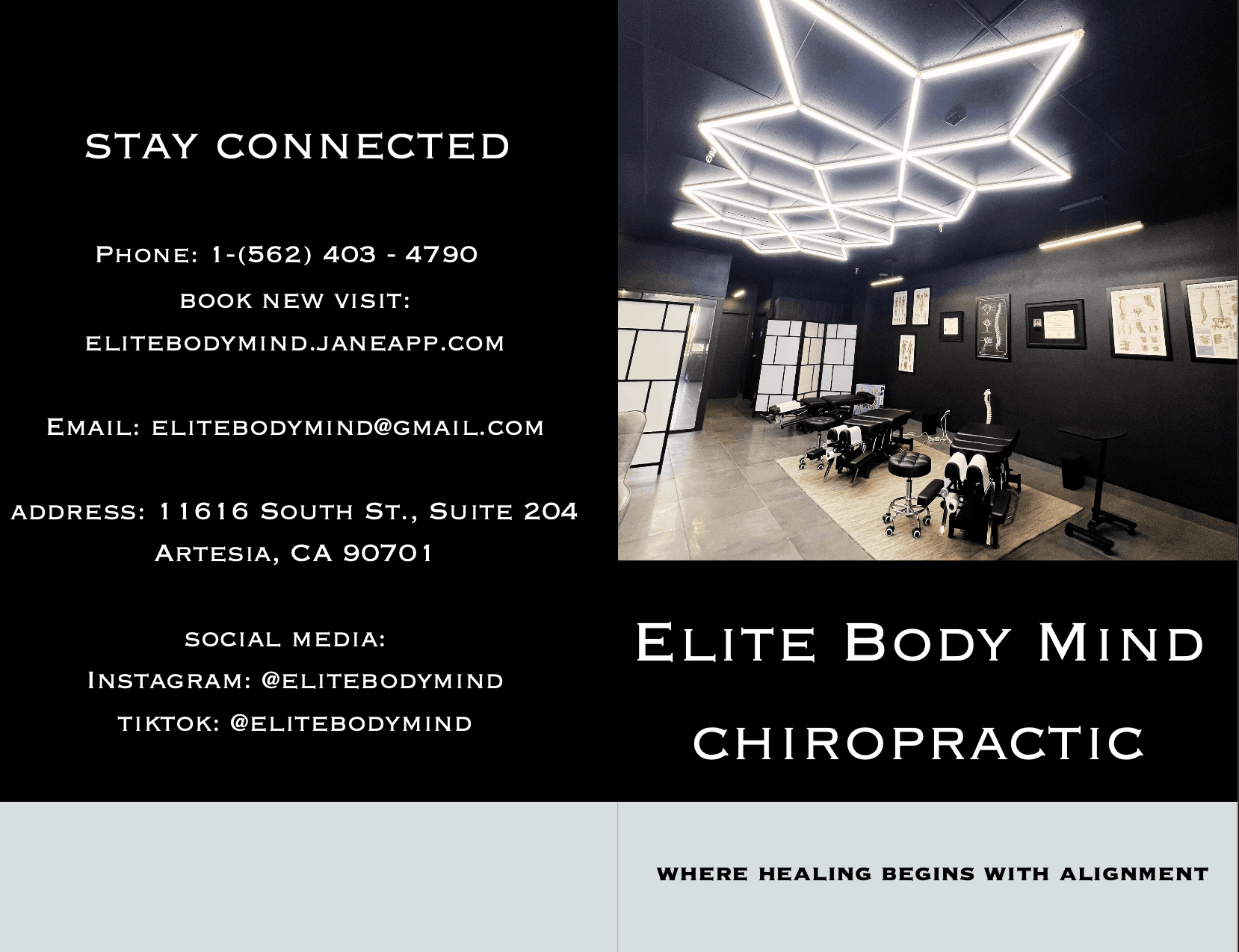
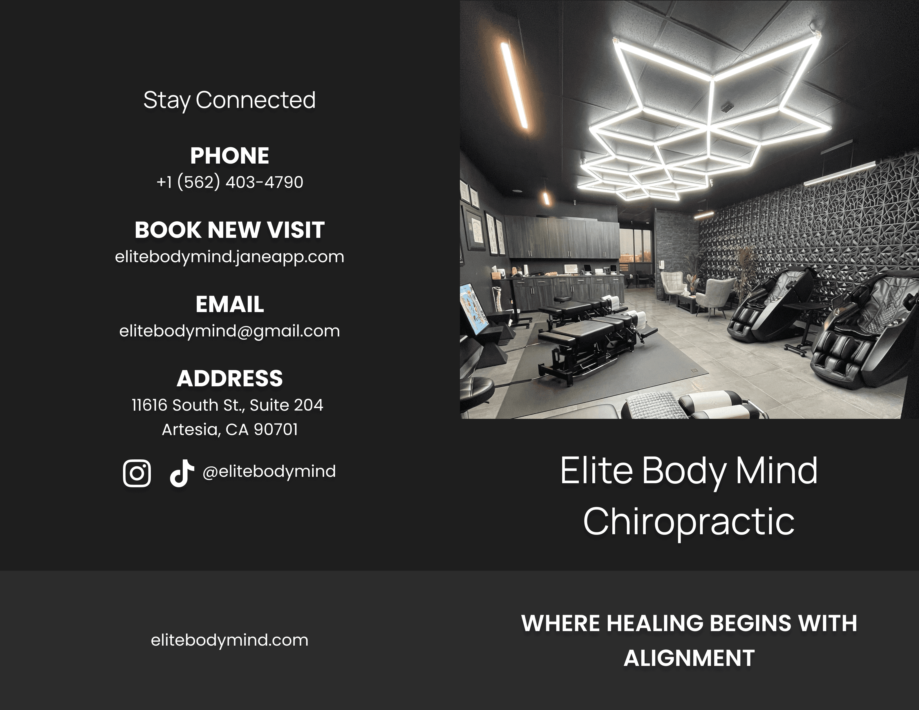
The original brochure did not match the branding style of the website or the clinic, so I ensured the font pack and colors used reflected the branding of the site and other digital assets.
With long paragraphs of copy requested by the client, I made sure to break up text into smaller sections to be more readable and easier on the eyes.
Pricing lists and membership options were grouped together similarly to ensure consistency across digital and print materials.
Brochure Pages
Outcome
The redesign increased site traffic by 122% and unique visitors by 103%
My client was very happy with the website and brochure redesign, voicing how clean the branding looked and how it matched their branding perfectly.
Reflection
Designing Mobile and Client First
Takeaway #1: Mobile-First Design is a Non-Negotiable
Takeaway #2: Client Feedback is a Tool
With redesigning an existing website rather than building from scratch, I assumed I could rely on the existing content as a foundation. However, midway through the redesign, I discovered I had incorporated outdated information that no longer reflected the clinic's current services, whichI never would have caught without looping the client back in. This reframed how I think about client feedback entirely. It's not a formality or a final approval step, but an active part of the design process. From that point on, I built structured check-ins into every milestone, which kept the work accurate, aligned, and true to the business at every stage.